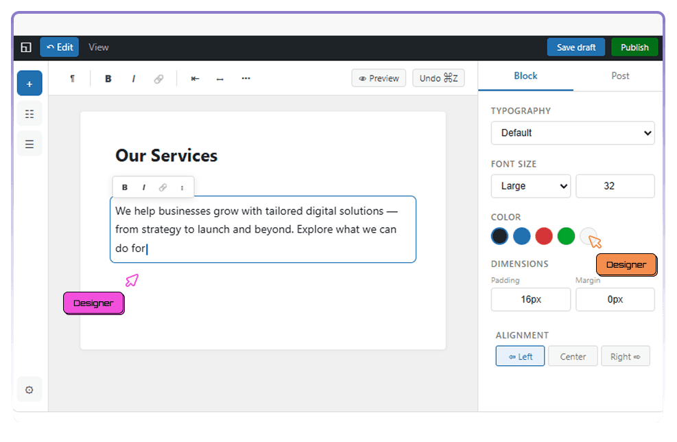
Design it once.

It ships pixel-perfect.

Designers
Developers
Marketers

You've been here before.

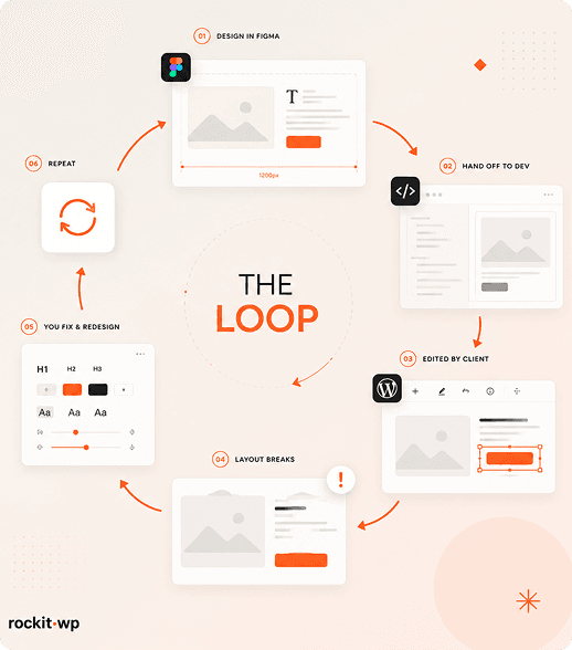
"That's not what I designed"

You handed off a pixel-perfect Figma file. What got built has the wrong spacing, inconsistent radius, and fonts that don't match. Sound familiar?

"Someone broke the layout again"

A content editor changed a section and now the spacing is off, the image is stretched, and the CTA is misaligned. You spend your morning fixing it.

"Design the same sections. Again."

Every new client project means redesigning heroes, feature grids, and testimonials from scratch. Hundreds of hours on sections you've designed a dozen times.

STYLE GUIDE

Set the rules once. Everything follows.

RockitWP's design token system is the single source of truth for every visual decision. Colors,
typography, spacing, border radius, shadows, and motion — defined once, applied everywhere.
Change a token, and every section across 260+ patterns updates instantly

Colors

Grayscale palette + single-letter accent system. One accent color powers the entire site.

PATTERN LIBRARY

260+ sections. Already designed. Fully flexible.

Heroes, feature grids, testimonials, pricing tables, CTAs, team sections, footers — every section type you'd design for a client is already here, in multiple variations. They all respect your design tokens, so adapting them to any brand takes minutes.

You're not locked into templates. Every block is fully flexible — change the layout, adjust the content, combine sections in new ways. The patterns are starting points, not constraints.

Browse library

PIXEL-PERFECT RENDERING

What you design is what gets
built. No compromise.

Token-driven rendering

Every visual property comes from your design tokens. The rendering engine reads the same source of truth you defined. No CSS overrides, no developer interpretation.

Responsive by default

EDITOR-PROOF DESIGN

Content editors add
content. Not design decisions.

The most frustrating part of handing off a design is watching
it degrade. Someone changes a font size. Someone uploads a
non-cropped image. Someone adds an extra section that
doesn't fit the grid.

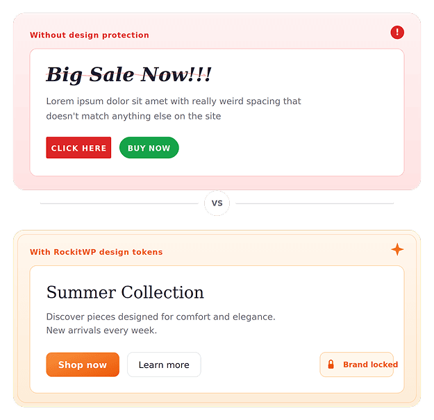
RockitWP prevents all of that. Content editors work within the blocks and patterns you've set up. They can change text,
swap images, rearrange sections — but they can't change the
typography scale, break the spacing, or go off-brand. The
design system is the guardrail.

  • Typography locked to your scale
  • Colors limited to your palette

AI WORKING

17 sites, 17 different looks.
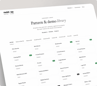
Starter Theme

A fully-featured SaaS application dashboard with analytics, user management.

See Demo

Your design workflow. Streamlined.

1

Traditional CMS

Define colors, fonts, spacing, and radius. This becomes the foundation every section inherits.
2

Free while in beta. Start
building now.

Start free
clutch-logo

Overall Review Rating

5/5

300+ Reviews

5/5

RockitWP
  • Simplify your stack and build anything. Or everything.

    Product overview
    Core
    • Page Builder
    • Headless CMS
    • AI assistant
    • Instant Previews
    Use Cases
    • Blocks Library
    • Patterns
    • Design System
    • Ecommerce
    • Performance & SEO
    Technlology
    • Next.js Frontend
    • WordPress Backend
    • WPGraphQL API
    • GSAP Animations
  • Build tomorrow’s web with a modern solution you truly own.

    Get started
    Who is it For
    • For Developers
    • For Designers
    • For Marketers
    • For Content Creators
    Use Cases
    • SaaS & Startups
    • Agencies & Studios
    • Ecommerce
    • Enterprise
    Technlology
    • vs Webflow
    • vs Contentful
    • vs Payload
    • vs Strapi
    • vs Sanity
    • vs WordPress
    • vs Squarespace
  • Learn
    • Getting Started Guide
    • Video Tutorials
    • Template & Starters
    • Case Studies
    Community
    • GitHub
    • Discord
    • Changelog
    • Roadmap
  • Demos
  • Docs
  • Pricing
  • Blog
Get started
RockitWP
  • Demos
  • Docs
  • Pricing
  • Blog
Get started

Product

Core
  • Page Builder
  • Headless CMS
  • AI assistant
  • Instant Previews
Use Cases
  • Blocks Library
  • Patterns
  • Design System
  • Ecommerce
  • Performance & SEO
Technlology
  • Next.js Frontend
  • WordPress Backend
  • WPGraphQL API
  • GSAP Animations
Get started

Solutions

Who is it For
  • For Developers
  • For Designers
  • For Marketers
  • For Content Creators
Use Cases
  • SaaS & Startups
  • Agencies & Studios
  • Ecommerce
  • Enterprise
Technlology
  • vs Webflow
  • vs Contentful
  • vs Payload
  • vs Strapi
  • vs Sanity
  • vs WordPress
  • vs Squarespace
Get started

Resources

Learn
  • Getting Started Guide
  • Video Tutorials
  • Template & Starters
  • Case Studies
Community
  • GitHub
  • Discord
  • Changelog
  • Roadmap
Get started
Content Creators

Typografy

DM Sans + Newsreader pairing. A complete type scale from xs to 6xl.

Heading

Subtitle in Newsreader

Body text in DM Sans

Radius

6 tiers from sharp to full. One setting changes every
corner on the site.

none

xs

sm

md

lg

full

Spacing

Section, component, and element level. Compact,
comfortable, or generous — system-wide.

Compact
Comfortable
Generous

Shadows

Subtle to strong elevation system. Adds depth without overwhelming the layout.

Gradients

Placeholder system for prototyping. Easily swappable with real assets later.

Every pattern is designed mobile-first and tested across breakpoints. Preview your design on desktop, tablet, and mobile in real time — before publishing.

GSAP animations built in

Scroll-triggered animations, parallax effects, and smooth transitions are part of the system. Define motion tokens once and every section animates consistently.

Spacing enforced by the system, not the person
  • Images auto-optimized and properly constrained
  • Digital Agency Demo

    A fully-featured SaaS application dashboard with analytics, user management.

    See Demo
    Wildpath

    Wildpath Agency Demo

    A fully-featured SaaS application dashboard with analytics, user management.

    See Demo
    Browse all

    Choose & customize patterns

    Browse 260+ sections. Pick the ones that fit the project. Adjust layouts, swap variations.

    3

    Preview on every device

    Preview the real output on desktop, tablet, and mobile. What you see is what goes live. No surprises.

    4

    Hand off with confidence

    Content editors can't break your design. The token system protects every decision you made.

    RockitWP

    Product

    • Product Overview
    • Page Builder
    • Blocks
    • Patterns
    • Design System
    • Performance & SEO
    • Ecommerce
    • Demo Sites
    • Pricing

    Solutions

    • For Developers
    • For Designers
    • For Marketers
    • For Content Creators
    • Agencies
    • SaaS
    • Ecommerce
    • Enterprise

    Resources

    • Documentation
    • Getting Started
    • API Reference
    • Templates
    • Blog
    • Changelog
    • Roadmap
    • GitHub
    • Discord

    Company

    • About
    • Contact
    • Case Studies
    • Support
    hello@rockitwp.com

    ©Copyright 2026 RockitWP. All rights reserved.