
Pixel-perfect
30+ blocks. Fully flexible.
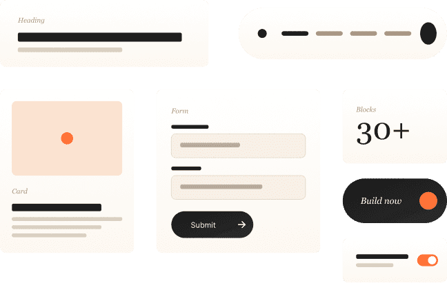
Blocks are the building components of every RockitWP page. Headings, images, buttons, cards, forms, navigation — everything you need to build any layout. What you create in the visual editor is exactly what your visitors see.
Every block is included. No premium tiers, no add-ons.

Editor = Frontend
What you build in the visual block editor is 1:1 with the live site. No interpretation, no "close enough." The editor output and the Next.js frontend are the same.
Full creative control
Every block is fully flexible. Control layout, spacing, typography, colors at a pixel level. Blocks follow your design tokens but don't limit what you can create.
Blocks → Patterns
Blocks are the components. Patterns are pre-
designed sections made from blocks. 260+
patterns give you a head start — or build entirely
custom layouts from blocks.
6 categories. 30+ blocks. Everything included.
Layout
Section, Grid, Container, Navigation
4 blocks
Typography
Heading, Paragraph, List, Blockquote
4 blocks
Media
Image, Video, Avatar, Icon
4 blocks
Interactive
Button, Link, Input, Select, Checkbox, Toggle
6 blocks
Display
Card, Badge, Tag, Tooltip, Divider, Breadcrumb
6 blocks
30+
total blocks
All included
From building components
to complete pages.
Blocks are the atoms. Combine them into sections — we call these patterns. 260+ patterns are pre-designed and ready to use. Or compose entirely custom layouts from blocks. Either way, what you build in the editor is 1:1 with the live site.
Blocks
Individual components — heading, image, button, card, grid
Patterns
Pre-designed sections made from blocks — heroes, feature grids, testimonials, CTAs
Pages
Stack patterns and custom block layouts into complete pages. Publish — live.
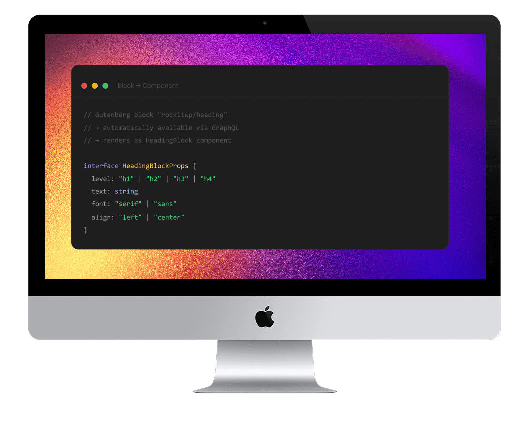
For developers: every block
is a typed component.
Each Gutenberg block maps to a React component on the Next.js frontend. Attributes are typed. Rendering is optimized. The mapping is automatic through the WPGraphQL pipeline.