
One config.
Every section follows.
Tokens define your brand. Blocks are the building components. Patterns are pre-designed sections made from blocks. Together, they form a design system where everything stays consistent — automatically.

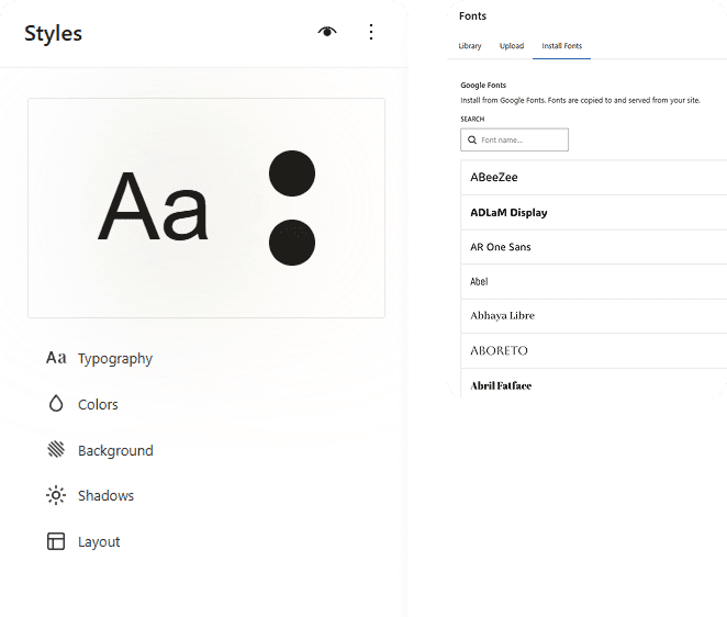
How the pieces fit together.
Three layers, one system. Each layer builds on the one before it.
01
Design Tokens
The foundation. Colors, typography, spacing, border radius, shadows — defined once. Every block and pattern reads from these tokens.
02
Blocks
30+ building components — headings, images, buttons, cards, forms, grids. Each block inherits your tokens and renders 1:1 on the frontend.
03
Patterns
260+ pre-designed sections made from blocks. Heroes, features, testimonials, pricing — all following your tokens. Or build fully custom from blocks.
Your design system isn't a
Figma file. It's the actual code.
Most design systems live in a document that developers interpret. Spacing gets approximated. Colors drift. Fonts don't match. After a few months, the live site looks nothing like the original design.
RockitWP's design tokens are the actual source of truth. The rendering engine reads the same config you defined. No interpretation. No drift. What you set is what gets rendered — on every page, every section, every device.

Change a color — every button, link, and accent updates
Change a font — every heading and body text reflows
Content editors can't break it — tokens enforce the rules
TOKEN CONFIGURATION
Set these once.
Everything follows.
Six token categories control every visual decision across your entire site.
Colors
Grayscale palette + single-letter accent system. One accent color powers the entire site.


Typografy
DM Sans + Newsreader pairing. A complete type scale from xs to 6xl.

Radius
6 tiers from sharp to full. One setting changes every
corner on the site.
none

xs

sm

md

lg

full
Spacing
Section, component, and element level. Compact,
comfortable, or generous — system-wide.
Shadows
Subtle to strong elevation system. Adds depth without overwhelming the layout.


Gradients
Placeholder system for prototyping. Easily swappable with real assets later.


FOR AGENCIES
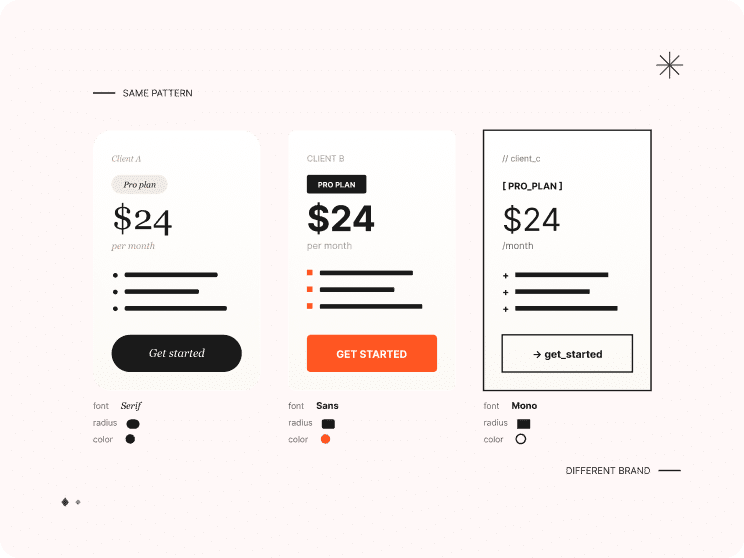
New client. Change tokens. New brand.
The same 260+ patterns work for every client. Swap the color palette, change the fonts, adjust the radius — and the entire library becomes a different brand. No redesigning sections from scratch. Project after project, faster.
Client brand applied in minutes, not days
Patterns reusable across every project
More projects, less repetitive design work
Your design survives
content editing.
Content editors work within the system you set up. They add content, rearrange
sections, and publish — but they can't change the typography scale, break the
spacing, or go off-brand. The tokens are the guardrail.
Typography is locked
Editors choose heading levels, not font sizes. The type scale enforces consistent hierarchy across every page.
Colors are limited
Only your defined palette is available. No random hex codes. Every section uses the same brand colors.
Spacing is automatic
Section padding, component gaps, and margins are system-controlled. Editors can't add arbitrary spacing that breaks the rhythm.